journal
Members get uncapped access to our amenities.
That means no hidden costs or creeping fees, it's all included.
Members get uncapped access to our amenities.
That means no hidden costs or creeping fees, it's all included.
Branding designer Daniel Ting Chong shares his journey from Cape Town to Sydney, the projects that shaped him, and the values that guide his creative practice.

From dropping out of university to founding Woolly Mammoth, Sam built a career around curiosity, courage, and creativity — blending design and technology to craft meaningful digital experiences.

From driving partnerships at HeadBox to trading whisky and conquering triathlons, Sarah brings energy, curiosity, and focus to everything she does.

Senior Content Coordinator Cassandra blends creativity and strategy at HeadBox — with a passion for storytelling, sleek editorial design, and dogs at work.

From HR in Paris to design leadership in Sydney, Will blends strategy, creativity, and Muay Thai energy.

From closing AI-powered deals to conquering half marathons, Rory brings drive, curiosity, and balance to life at HeadBox and beyond.

Katie, Project Manager at act.3 Australia, shares how she landed her dream role through the Desk Space Slack and why creative storytelling keeps her coming back for more.

Danai is a Senior Project Manager at act.3 Australia, leading high-energy brand campaigns and events — and bringing a footballer’s focus to everything he does.

Samantha leads act.3 Australia, blending storytelling and strategy to create bold cultural work for global brands and causes — always with heart and purpose.

Barbara is the force behind Garage Sale Trail, helping Aussies embrace secondhand living through sustainability, storytelling, and the joy of giving pre-loved items a second life.

Typography isn’t just decoration—it’s a force for action and cultural influence. While trends reports can spark inspiration, they often risk promoting sameness. Monotype’s 2025 report, Re:Vision,

Two of Australia’s most-loved hospitality brands came together to create something deliciously unexpected. Late last year, Maybe Sammy and Gelato Messina launched a limited-edition trio.

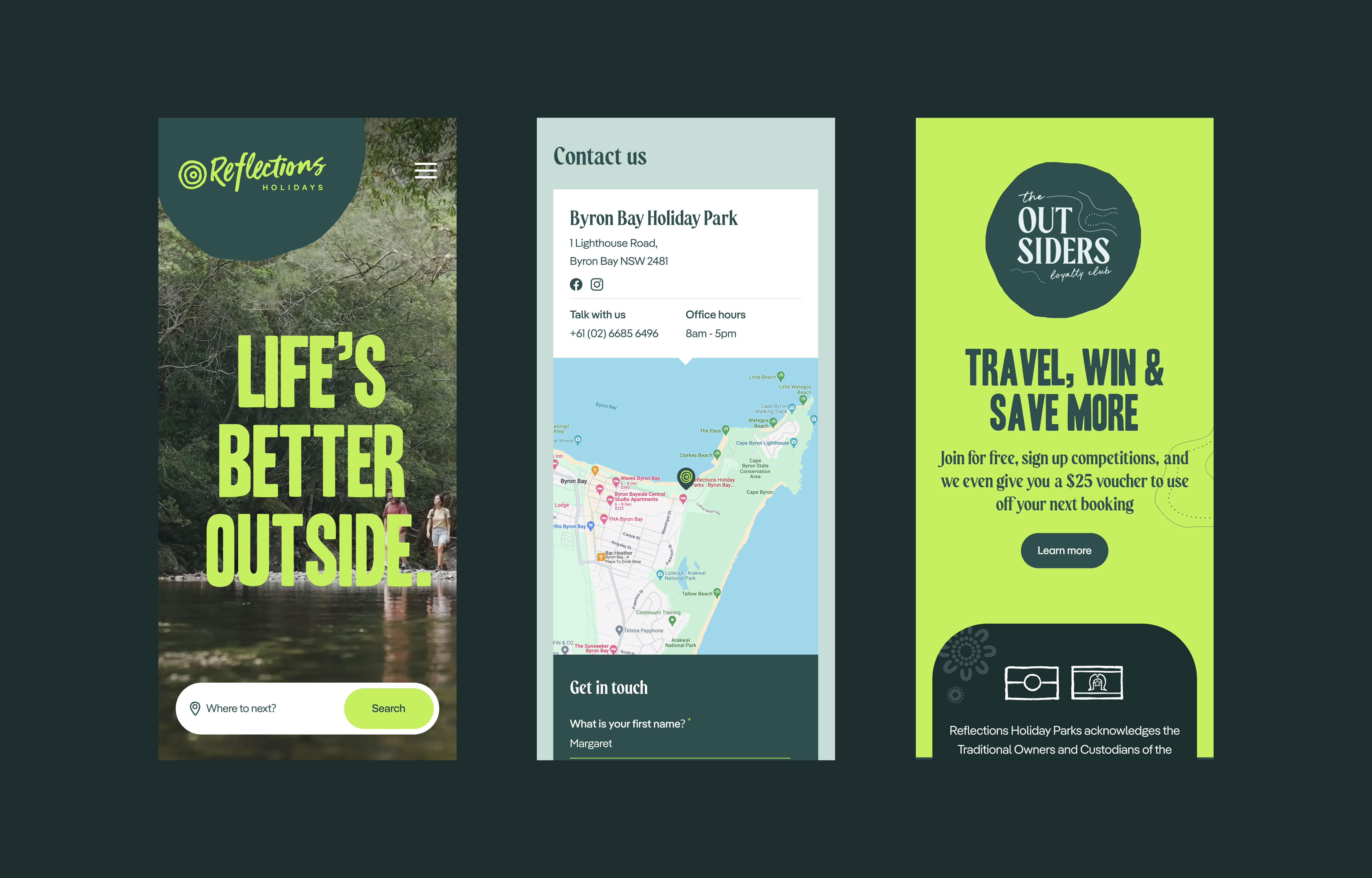
From beach stays to bush retreats, Reflections Holidays offers a uniquely Australian way to unwind. To evolve their digital experience, they partnered with Woolly Mammoth to lead the way.

A bold electric vision meets New Zealand’s creative energy. In Polestar Profiles, Not Another™ brings together storytelling, design, and sustainability to spotlight.

Zara’s story takes us from nursing shifts to startup success. Learn how she founded uPaged to put control back in the hands of healthcare professionals — and what drives her mission today.

From Brighton to Sydney: Kieran’s Journey in the Event-Tech Industry

The playlist is designed to foster concentration during the workday, especially during that inevitable afternoon dip in focus.

Tess's journey is a testament to the power of passion, hard work, and creativity.

“Music creates these beautiful spaces, community and connection between people”

"I wanted to lean into a mix of global sounds that are funky and fun, but not so distracting from your work"

The Vision: A Smarter, More Connected Healthcare System

“That could be for people just coming back from their lunch break, to get them back in the motion of the playlist.”

“As a start-up, having access to people who work in different areas has been a game changer"

“You just build an incredible network while you’re in the space,” says Benson. “Desk Space becomes this honey pot to attract all of the relevant bees.”

“Being part of a culture and community of like-minded founders is a wonderful thing,”

Driva’s co-founder unpacks the business’s rapid growth and how much of its early success sprang from its co-working space.

Suhm is a testament to the power of collaboration and the belief that great design should be shared.

This work goes beyond branding; it’s about telling a story through colours, shapes, and bold visual language.
